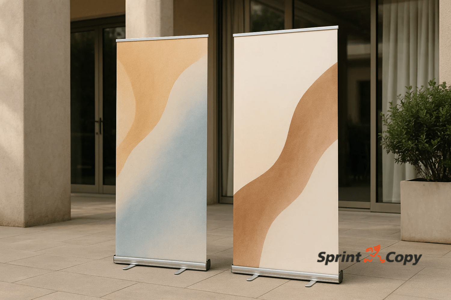
A promotional banner is often the first impression someone has of your brand. Whether it’s displayed at a trade show, in a shop window, or on an outdoor façade, its design must communicate clearly, visually, and professionally. However, even the best ideas can lose impact if design or print preparation mistakes occur.
At SprintCopy, we’ve spent over 40 years helping businesses stand out with promotional banners that attract, communicate, and sell. Here, we share the most common banner design mistakes and how to avoid them.
The Importance of Good Design in a Promotional Banner
A banner is more than just a visual support; it’s a strategic communication tool to increase brand awareness and attract your audience’s attention. Its success lies in balancing design, message, and functionality.
A professional design enhances trust, strengthens brand recall, and conveys your brand’s values instantly.
Overloading the Design with Too Much Information
One of the most frequent errors is trying to say everything in one space.
A banner must be clear and direct viewers only have a few seconds to read it, so the main message must be immediately legible.
SprintCopy Tip: Keep the text short and focused on one message and a clear call to action (CTA). Use icons or images to reinforce your message instead of cluttering the design with text.
Using Low-Quality Images or Fonts
Pixelated images, unreadable fonts, or inconsistent styles can ruin an otherwise great design. Remember: banners are usually printed in large format, so any quality flaw becomes much more noticeable.
SprintCopy Tip: Always use high-resolution images (300 dpi) and brand-consistent fonts. Our team can check your files before printing to ensure a flawless final result.
Ignoring Visual Hierarchy and White Space
The human eye needs structure to read effectively. When every element competes for attention, your message gets lost. A good visual hierarchy guides the viewer’s eye, highlighting the key elements in order of importance.
SprintCopy Tip: Prioritize your logo, main message, and call to action. Use white space as a design element not empty space to make your message stand out.
Ignoring Format and Viewing Distance
Designing a banner without considering where it will be placed is another common error. A design that looks good on screen may lose impact if installed too high, too low, or with too much text for the viewing distance.
SprintCopy Tip: Adapt font size, contrast, and layout according to the environment. Indoor banners differ greatly from outdoor or trade show formats. SprintCopy can help you adjust your design to the final print format.
Neglecting Brand Consistency
Every banner should be a visual extension of your brand. Using different colors, non-corporate fonts, or inconsistent styles causes confusion and weakens your brand identity.
SprintCopy Tip: Maintain visual consistency across all materials. At SprintCopy, we help you correctly apply your corporate identity guidelines to every printed support.
Forgetting About Printing and Materials
Designing without considering the printing process can lead to technical problems incorrect bleeds, color mismatches, or incompatible formats.
Choosing the wrong materials can also reduce durability, especially outdoors.
SprintCopy Tip: Always consult a print specialist before production. At SprintCopy, we use weather-resistant materials and UV-stable inks to guarantee high-quality large-format printing that lasts.
How to Design an Effective Promotional Banner: Best Practices and Final Tips
A great banner communicates more with less. Remember these key points:
-
- Focus on one clear communication goal.
- Use sharp images and easy-to-read text.
- Ensure contrast between background and text.
- Keep brand consistency across all materials.
- Consult print experts before production.
At SprintCopy, we help you turn your ideas into professional banners that stand out in any environment, trade shows, storefronts, façades, or points of sale.
Make Your Brand Stand Out with SprintCopy
At SprintCopy, we transform your designs into banners that capture attention and deliver your message powerfully. We guide you through every step design, materials, format, and printing to ensure a flawless result. Request your personalized quote today and discover how to make your brand seen and remembered.
We print the difference.
Frequently Asked Questions About Designing Promotional Banners
1. What is the most common mistake when designing an advertising banner?
The most common mistake is overloading the design with too much text or information. A banner should deliver one clear, visually strong message. At SprintCopy, we recommend prioritizing a powerful headline, a relevant image, and a simple call to action.
2. How can I make sure my banner is readable from a distance?
To ensure readability, maintain a clear visual hierarchy, use large fonts, and apply strong color contrast. The format should match the viewing distance. SprintCopy advises on optimal sizes and typography depending on where your banner will be displayed (trade shows, storefronts, or outdoors).
3. Why is it important to use high-resolution images for banners?
Because banners are printed in large format, low-resolution images become pixelated and blurry when enlarged. Ideally, use 300 dpi files or higher. SprintCopy checks and adjusts your files before printing to guarantee a professional, crisp result.
4. What’s the best material for indoor or outdoor banners?
It depends on the environment and campaign duration:
-
- For indoor banners, lightweight vinyl or fabric provides an elegant finish.
- For outdoor banners, we recommend reinforced PVC or mesh materials for resistance to sun, rain, and wind.
SprintCopy uses certified materials and long-lasting inks to ensure vibrant colors and durability even in demanding conditions.
5. How can I avoid mistakes before printing my promotional banner?
The key is a professional prepress review. Ensure proper bleeds, CMYK color mode, and embedded fonts. At SprintCopy, we offer a complete prepress service checking every detail before production to guarantee a flawless print result.