How to design corporate folders that make an impact and reflect your brand
Designing corporate folders is a strategic opportunity to reinforce your company’s visual identity and leave a lasting impression on clients, partners, or collaborators. Beyond their function for organizing and presenting documents, folders serve as a direct reflection of your brand.
If you’re wondering how to design corporate folders that truly convey professionalism, this practical guide will walk you through the essentials.
What role do corporate folders play in your brand strategy?
Corporate folders are key tools in printed branding. They help present quotes, proposals or brochures, while also projecting professionalism and visual consistency.
Using custom folders with your logo and brand colors reinforces brand recognition—especially in meetings, trade shows or events. They also help communicate values like organization, attention to detail and image care, which directly influence how your business is perceived.
Key elements every corporate folder design must include
Color palette and visual consistency
The color scheme should align with your brand guidelines. Corporate colors should dominate the design, balanced with neutral tones that provide elegance and harmony.
Typography and graphic style
Use fonts that are consistent with your overall communication. Ensure the text is readable and avoid decorative fonts that could reduce legibility or clash with a professional image.
Logo, tagline and brand elements
Your logo should be placed strategically—usually on the front cover. You may also include your tagline, social media icons or certifications that add value and credibility.
Contact details and calls to action
Including contact information is essential. Phone number, email, website or QR codes should be clearly visible, but subtly integrated into the design.
Practical space for documents, brochures or business cards
Design your folder with internal pockets, card slots or holders that allow you to include printed materials neatly and securely.
Types of corporate folders by format and use
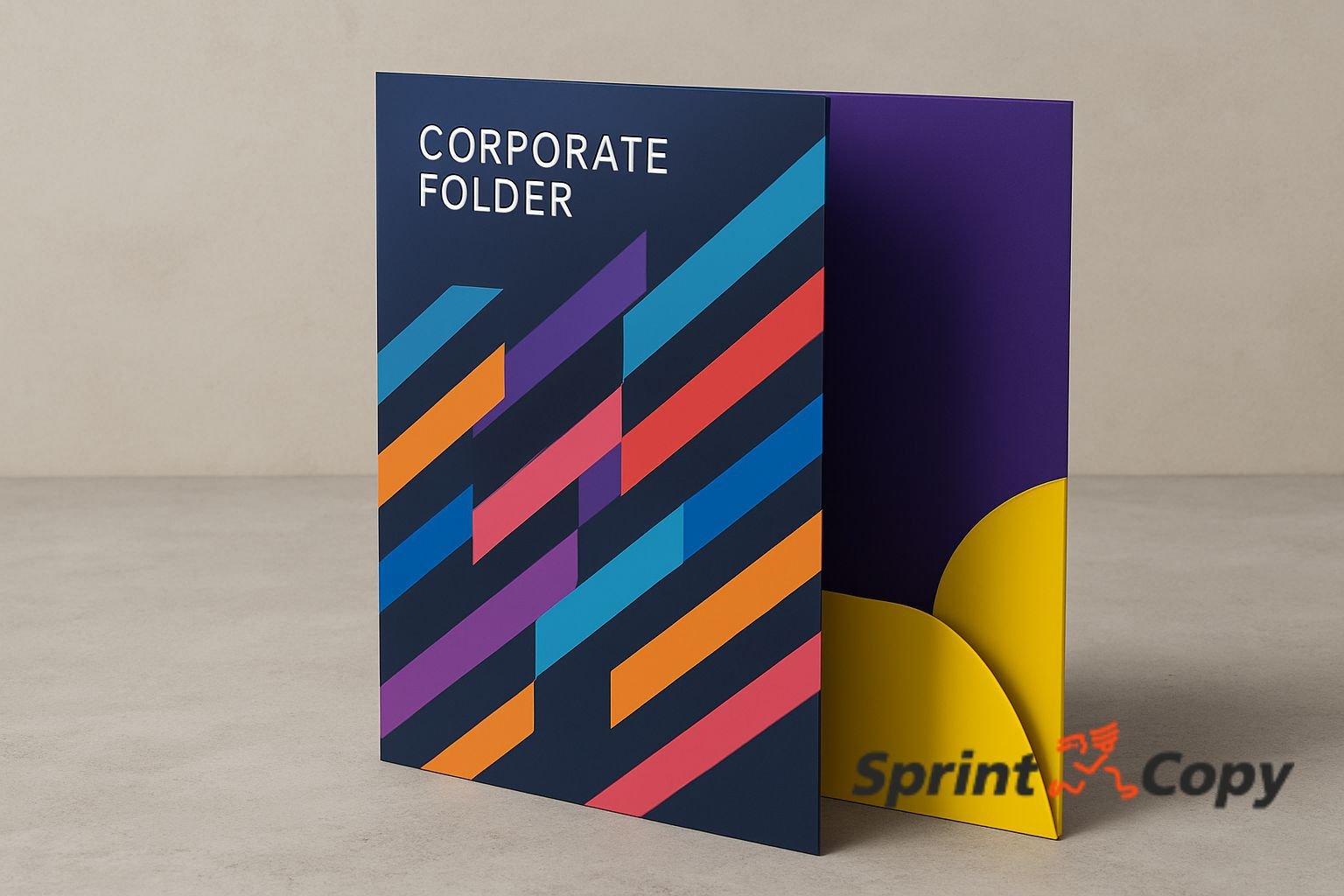
Folders with flaps or interior pockets
Ideal for holding multiple documents without them slipping out. These are the most common choice for quotes, presentations and business meetings.
Bi-fold and tri-fold folders
These formats offer more space for graphic design. Tri-fold folders, with three panels, allow for better organization of visual and written content.
Folders with closures or rings
Perfect for manuals, reports or large presentations. These add durability and structure, though they typically come at a higher printing cost.
Technical aspects to consider before printing your folder
Final size and format
The standard size is A4 (210 x 297 mm), but you can adjust based on content. Be sure to leave room for folds and internal pockets in the layout.
Paper, weight and recommended finishes
Graphic cardstock or coated paper between 300 and 350 g/m² is ideal to ensure stiffness and resistance. For a premium finish, consider matte or gloss lamination.
Lamination, varnish and high-end touches
Finishes like UV varnish, foil stamping or embossing add distinction. These upgrades enhance the perceived quality and professionalism of your folder.
File format and bleed margins
Export the final design as a high-resolution PDF with 3 mm bleed and crop marks. Check with your printing provider if a specific template is required.
Tools and software for designing professional folders
To create a polished and effective design, consider using graphic design software such as:
- Adobe Illustrator or InDesign – ideal for advanced users.
- Affinity Designer – a powerful, more affordable alternative.
- Canva Pro – great for businesses without a design team, offering customizable templates.
If you don’t have experience with design software, it’s best to work with a professional who can translate your brand identity into an effective folder format.
Common mistakes when designing corporate folders (and how to avoid them)
Some mistakes can undermine an otherwise good design. These are the most common pitfalls:
- Overloading the layout: too many elements clutter the message and confuse the reader.
- Ignoring margins and bleed: can lead to poor cuts during printing.
- Using low-resolution images: results in a blurry, unprofessional final product.
- Inconsistent branding: designs that don’t align with your identity can generate distrust.
Avoiding these errors is key to achieving a clean and professional result.
Conclusion: your corporate folder as an extension of your brand
Designing corporate folders is an investment in image, professionalism and communication. It’s not just about aesthetics—it’s about projecting trust, consistency and attention to detail. A well-designed folder speaks volumes about your business before you say a single word.
Want your folder to make the right impression?
At Sprint Copy, we design and print custom corporate folders aligned with your brand identity. Contact us and project a professional image from the very first document.